Here are the WIP shots of the Overlord plushie. Not too many pics, and I apologize for the poor photo quality: I had taken the shots with my phone.
Sunday, August 21, 2011
Monday, August 15, 2011
Spawn More Overlords!!
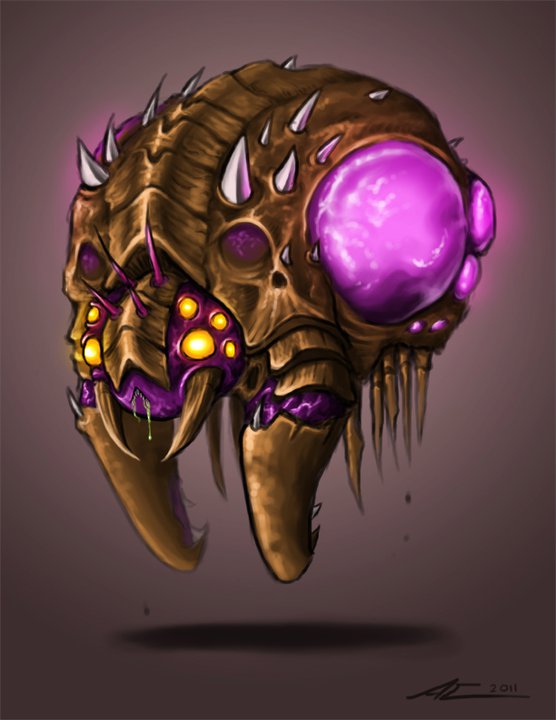
A couple months ago I had painted this picture of a chibi-nized Overlord, one of the Zerg units in StarCraft II:
It got some positive reception on the interwebs but among the comments there were suggestions asking for a plushie version of him. I thought about it and decided: "Hey! Why not?"
Out of all the plushies I've made over the years, this guy turned out to be the largest and most cumbersome to make. He's massive: travel-wise, he takes up an entire check-in bag. It took about 2 weeks to complete him. My chibi drawing of him was the primary reference guide, although I did look back at Blizzard's original concept and artist, Mr. Jack's, version several times just to make sure the design was accurate. The design was simplified over the course of the project, but otherwise the sewing pattern was improvised the whole way through. Here are the turnaround shots:
He's even got a zipper on the bottom... so he can creep...
Overall, even though he was a pain to make, I was very happy with the end result. Trying to make an Overlord squishable worked out, thanks to the brown ultra cuddle fabric I used. He is a bit difficult to hug... (he's too round and my arms can't wrap around him), but nevertheless he makes for an excellent pillow.
Other materials I used:
- pink fleece
- purple, velvety kind of fabric (found it in the scrap bin at Jo-Ann's)
- yellow linen (found in the scrap bin, too)
- white cotton t-shirt (for the spikes)
- green t-shirt (for the pouch in his belly)
- Poly-fil
- polyester batting (to fill the armor plates)
- green puffy fabric paint (for the drool dripping down his mouth)
I took WIP shots but they're all on my phone. I'll have to find a way to upload them here if I can.
It got some positive reception on the interwebs but among the comments there were suggestions asking for a plushie version of him. I thought about it and decided: "Hey! Why not?"
The head turned out crooked but I kinda liked it that way because it looked like he was thinking. :'D
... or store your StarCraft II art book. :'DOverall, even though he was a pain to make, I was very happy with the end result. Trying to make an Overlord squishable worked out, thanks to the brown ultra cuddle fabric I used. He is a bit difficult to hug... (he's too round and my arms can't wrap around him), but nevertheless he makes for an excellent pillow.
Other materials I used:
- pink fleece
- purple, velvety kind of fabric (found it in the scrap bin at Jo-Ann's)
- yellow linen (found in the scrap bin, too)
- white cotton t-shirt (for the spikes)
- green t-shirt (for the pouch in his belly)
- Poly-fil
- polyester batting (to fill the armor plates)
- green puffy fabric paint (for the drool dripping down his mouth)
I took WIP shots but they're all on my phone. I'll have to find a way to upload them here if I can.
Wednesday, July 20, 2011
Process Log 3: Victreebel Redesign
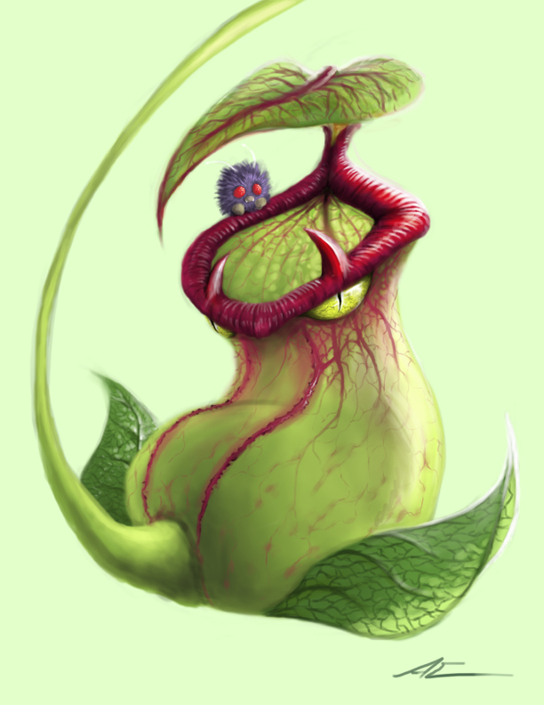
This redesign of one of the original 150 Pokemon came about because of the Pokemon Redesign competition on CGHub. Here's the original Pokemon design:
The goal of the competition was to redesign a Pokemon so that it would fit in a live action movie, so anatomical accuracy was a key point in this contest. I didn't take too many process shots for this one but here we go:
This was the initial sketch I had in mind. As I mentioned in the Process Log 2: Sean, I'm still not comfortable painting in semi-realism, so the best way for me to start laying out the anatomy and form is to draw the line art and paint the colors on a separate layer on top of the lines.
Also, I want the point of most interest to occur around Victreebel's mouth area. The little bug that's hanging onto Victreebel's mouth is a Venonat (another Pokemon) who's colors would add a nice contrast to the rest of the composition I had in mind.
The initial sketch looked too stiff so I changed the whole composition and pose of the character to add more fluidity to the whole piece. Started painting the colors over the line art (you can see the line art under the colors here).
Painting in the detail on the main body. I looked up a bunch of reference pics of pitcher plants and the ones I found most interest in had these red veins branching out on their top leaves. I added that to Victreebel's leaf and main body, a little twist I gave it to differ from the original design. Plus, the red veins trailing down from the mouth seemed like a good way for the eye to travel across the composition. For the eye, I looked up alligator and crocodile eyes as reference.
Now moving onto painting in the lighting. I'm not too familiar with painting foliage, so getting the transparency of the leaves and even the main body was tricky. I looked up so many reference images, too, studying how the light travels through leaves. I also talked to a great friend of mine, Kez, for advice and a critique to get past this road block - she's a beast at painting foliage and creatures! Check her out: http://kezrek.blogspot.com/
And here is the final image. Through Kez's crit, the top leaf's "pose" changed to make it look more readable, the spec on the lips were adjusted to match the placement of the light's source, and the shadows of the light traveling through the main body were enhanced.
The process of painting this piece was a lot of fun not only because I got to practice semi-realism more, but because the subject was a Pokemon. :'D I love Pokemon. My Charmander doll and Pokemon cards I have since I was 7 proves it. Victreebel isn't my favorite Pokemon, but the reason I chose it was to paint a realistic Pokemon you don't normally see on the Internet. When I search for "realistic Pokemon", I get a lot of the badass ones like Mewtwo, Pinsir, Kabutops, Charizard, etc., so as I was thinking of which Pokemon to paint I was like, "Hey, grass type Pokemon don't get a lot of recognition. Let's paint Victreebel cuz he's pretty cool." And then after that, Victreebel became one of my favorite grass types.
What I learned from this painting:
- painting light through foliage (understanding how light travels through leaves and transparent forms, nailing the spec on the surface of leaves and the lips of pitcher plants)
- practice painting points of interest, in this case, the mouth region
(property of Nintendo, GameFreak)
The goal of the competition was to redesign a Pokemon so that it would fit in a live action movie, so anatomical accuracy was a key point in this contest. I didn't take too many process shots for this one but here we go:
This was the initial sketch I had in mind. As I mentioned in the Process Log 2: Sean, I'm still not comfortable painting in semi-realism, so the best way for me to start laying out the anatomy and form is to draw the line art and paint the colors on a separate layer on top of the lines.
Also, I want the point of most interest to occur around Victreebel's mouth area. The little bug that's hanging onto Victreebel's mouth is a Venonat (another Pokemon) who's colors would add a nice contrast to the rest of the composition I had in mind.
The initial sketch looked too stiff so I changed the whole composition and pose of the character to add more fluidity to the whole piece. Started painting the colors over the line art (you can see the line art under the colors here).
Painting in the detail on the main body. I looked up a bunch of reference pics of pitcher plants and the ones I found most interest in had these red veins branching out on their top leaves. I added that to Victreebel's leaf and main body, a little twist I gave it to differ from the original design. Plus, the red veins trailing down from the mouth seemed like a good way for the eye to travel across the composition. For the eye, I looked up alligator and crocodile eyes as reference.
Now moving onto painting in the lighting. I'm not too familiar with painting foliage, so getting the transparency of the leaves and even the main body was tricky. I looked up so many reference images, too, studying how the light travels through leaves. I also talked to a great friend of mine, Kez, for advice and a critique to get past this road block - she's a beast at painting foliage and creatures! Check her out: http://kezrek.blogspot.com/
And here is the final image. Through Kez's crit, the top leaf's "pose" changed to make it look more readable, the spec on the lips were adjusted to match the placement of the light's source, and the shadows of the light traveling through the main body were enhanced.
The process of painting this piece was a lot of fun not only because I got to practice semi-realism more, but because the subject was a Pokemon. :'D I love Pokemon. My Charmander doll and Pokemon cards I have since I was 7 proves it. Victreebel isn't my favorite Pokemon, but the reason I chose it was to paint a realistic Pokemon you don't normally see on the Internet. When I search for "realistic Pokemon", I get a lot of the badass ones like Mewtwo, Pinsir, Kabutops, Charizard, etc., so as I was thinking of which Pokemon to paint I was like, "Hey, grass type Pokemon don't get a lot of recognition. Let's paint Victreebel cuz he's pretty cool." And then after that, Victreebel became one of my favorite grass types.
What I learned from this painting:
- painting light through foliage (understanding how light travels through leaves and transparent forms, nailing the spec on the surface of leaves and the lips of pitcher plants)
- practice painting points of interest, in this case, the mouth region
Tuesday, July 19, 2011
The Scrap Pile: Jeid
There are so many paintings I start and finish, but some of them just don't live up to the vision that was in my head when I began the painting process. It sucks when this happens because you put all this time and effort into a potential piece of awesome work and you end up with a product that doesn't satisfy you. It hurts even more when you dig up these almost forgotten paintings and you remember all that hard work gone to waste.
So in light of all that effort, I'm starting a new series of posts called "The Scrap Pile". These posts will be of some works that were either never completed or completed but kinda sucked.
This first post is of a character I came up with after going through a Prince of Persia phase and watching that PoP movie :P The movie was... meh... but it did have some pretty cool, inspirational parts. This image had a lot more than effort in painting - it had a whole backstory behind it, too! T^T
Backstory:
The character, Jeid, is of a race of outlaws known as the Resh-Anen. Resh-Anen people are notorious for their barbaric nature and passion for battle, and they are greatly feared throughout the desert lands ruled by the peaceful Holy Cities. People born outside the Holy Cities or banished from these cities are labeled as Resh-Anen.
Jeid is unique, however, in that he was born from a short-lived relationship between a Holy City priestess and a Resh-Anen bandit lord. He doesn't remember anything about his parents apart from a jade leaf hair accessory that he always wears - a rare piece of jewelry that only Holy temple monks and priestesses adorn. As an infant, he was abandoned at Ckessa, also known as the Trader's City and largest settlement in the land. There, he grew up fending for himself and thriving off of stolen food and goods. When he was 16, he met a small group of Resh-Anen thieves that prided themselves in raiding Holy City temples. By that time, Jeid had developed considerable skill in the art of freerunning and close combat, therefore he was enlisted into the group.
So is the backstory of the character known as Jeid. There even was a main storyline but I might save that for later, just in case I ever want to pick it up again...
The Painting Itself:
What I wanted to accomplish in this painting was lighting. I was thinking about the art style in the 4th PoP game as well as the atmosphere and colors from Aladdin as inspiration to painting this piece. I really wanted to get that cool contrast between the cold moonlight and warm torch light. I also wanted the transition of contrasting colors to happen on the character, so I got to play around with painting cool shadows and warm highlights. I really enjoyed painting the lighting on the character and I was satisfied with the end result. What killed me most from this painting was the background.
I suck at painting environments. It's always been a letdown for me and it's an area I'm trying to practice on. With such rich lighting, this painting demanded an environment for the character to stand in. I thought of a temple or a tomb at first - that's why that random column behind Jeid is there - but it didn't give me that sense of cool, mysterious moonlight. So I changed that idea into the open desert. I kept the column because it was suppose to reflect the warm light coming from an unseen torch. I tried to portray that by putting a torch in the distance, indicating that Jeid may be standing by an outpost or something...
What am I saying? I really don't know. All that was an example of me trying to make sense of the background I was struggling to portray. In the end, I rushed the backdrop and didn't put as much effort and detail into it as I did the character. Therefore, in my eyes, this painting failed.
So in light of all that effort, I'm starting a new series of posts called "The Scrap Pile". These posts will be of some works that were either never completed or completed but kinda sucked.
* * *
Backstory:
The character, Jeid, is of a race of outlaws known as the Resh-Anen. Resh-Anen people are notorious for their barbaric nature and passion for battle, and they are greatly feared throughout the desert lands ruled by the peaceful Holy Cities. People born outside the Holy Cities or banished from these cities are labeled as Resh-Anen.
Jeid is unique, however, in that he was born from a short-lived relationship between a Holy City priestess and a Resh-Anen bandit lord. He doesn't remember anything about his parents apart from a jade leaf hair accessory that he always wears - a rare piece of jewelry that only Holy temple monks and priestesses adorn. As an infant, he was abandoned at Ckessa, also known as the Trader's City and largest settlement in the land. There, he grew up fending for himself and thriving off of stolen food and goods. When he was 16, he met a small group of Resh-Anen thieves that prided themselves in raiding Holy City temples. By that time, Jeid had developed considerable skill in the art of freerunning and close combat, therefore he was enlisted into the group.
So is the backstory of the character known as Jeid. There even was a main storyline but I might save that for later, just in case I ever want to pick it up again...
The Painting Itself:
What I wanted to accomplish in this painting was lighting. I was thinking about the art style in the 4th PoP game as well as the atmosphere and colors from Aladdin as inspiration to painting this piece. I really wanted to get that cool contrast between the cold moonlight and warm torch light. I also wanted the transition of contrasting colors to happen on the character, so I got to play around with painting cool shadows and warm highlights. I really enjoyed painting the lighting on the character and I was satisfied with the end result. What killed me most from this painting was the background.
I suck at painting environments. It's always been a letdown for me and it's an area I'm trying to practice on. With such rich lighting, this painting demanded an environment for the character to stand in. I thought of a temple or a tomb at first - that's why that random column behind Jeid is there - but it didn't give me that sense of cool, mysterious moonlight. So I changed that idea into the open desert. I kept the column because it was suppose to reflect the warm light coming from an unseen torch. I tried to portray that by putting a torch in the distance, indicating that Jeid may be standing by an outpost or something...
What am I saying? I really don't know. All that was an example of me trying to make sense of the background I was struggling to portray. In the end, I rushed the backdrop and didn't put as much effort and detail into it as I did the character. Therefore, in my eyes, this painting failed.
Process Log 2: Sean
Here are the images I took while painting "Sean". WARNING: The order of these images may be a bit confusing, so I apologize in advance.
Started out by laying out basic colors and shading. I have yet to be comfortable with painting in semi-realism - I'm so used to drawing line art and laying out the map of the subject as opposed to going straight to coloring the forms.
Worked on defining the forms by emphasizing the lighting - usually the first thing I do is darken the shadows. Then for some reason I decided to start adding detail on the lips - probably because I wasn't so sure how to paint the details of the scars yet. You can see the first steps of the experimental progress of painting the scars.
I felt like the guy needed more indications of gore... so I put this huge bruise/gash on the corner of his mouth. Added a texture to the skin to make the surface more interesting. Also painting in more small details and adjusting skin specularity.
Trailing up the scar now. I knew at the start the giant scar was from a burn and it was inflicted somewhat recently. I did some research on burn scar classifications and the type I wanted to paint was called "hypertrophic" (where the scar looks puffy).
I started laying out the details of the scars by painting in the shadows first. Then I painted in a more saturated pinkish hue from the base scar color to make the scar pop. Spec was added and lastly that pink stroke around the scar's form to make it look like it's blending into the skin.
...and finally the completed painting! I spent so much time and effort in this painting - it was difficult but nonetheless very exciting. What I learned from this painting:
- different types of burn scars
- painting scars, especially getting the spec right
- more practice painting in semi-realism (getting skin spec right, painting shadows on face and neck)
- careful attention to detail
I love to paint small detail, so I got to geek out all over this painting. It's important to paint the big, broad shapes first so that the subject reads from a distance. Without those big brushstrokes, small detail is useless.
Started out by laying out basic colors and shading. I have yet to be comfortable with painting in semi-realism - I'm so used to drawing line art and laying out the map of the subject as opposed to going straight to coloring the forms.
Worked on defining the forms by emphasizing the lighting - usually the first thing I do is darken the shadows. Then for some reason I decided to start adding detail on the lips - probably because I wasn't so sure how to paint the details of the scars yet. You can see the first steps of the experimental progress of painting the scars.
I felt like the guy needed more indications of gore... so I put this huge bruise/gash on the corner of his mouth. Added a texture to the skin to make the surface more interesting. Also painting in more small details and adjusting skin specularity.
Trailing up the scar now. I knew at the start the giant scar was from a burn and it was inflicted somewhat recently. I did some research on burn scar classifications and the type I wanted to paint was called "hypertrophic" (where the scar looks puffy).
I started laying out the details of the scars by painting in the shadows first. Then I painted in a more saturated pinkish hue from the base scar color to make the scar pop. Spec was added and lastly that pink stroke around the scar's form to make it look like it's blending into the skin.
...and finally the completed painting! I spent so much time and effort in this painting - it was difficult but nonetheless very exciting. What I learned from this painting:
- different types of burn scars
- painting scars, especially getting the spec right
- more practice painting in semi-realism (getting skin spec right, painting shadows on face and neck)
- careful attention to detail
I love to paint small detail, so I got to geek out all over this painting. It's important to paint the big, broad shapes first so that the subject reads from a distance. Without those big brushstrokes, small detail is useless.
Subscribe to:
Posts (Atom)